🧪 Filtros (filter-*)
Estas utilidades aplican efectos directamente sobre un elemento. Incluyen desenfoques, brillo, saturación, escala
de grises y más. Para activarlos se usa la clase filter junto con las utilidades específicas.
| Clase Tailwind | Equivalente CSS | Imagen Original | Imagen con Filtro |
|---|---|---|---|
| filter | filter: var(--tw-filter); | 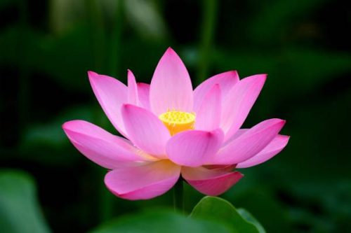
|
|
| filter-none | filter: none; |
|
|
| blur-sm | blur(4px) |
|
|
| blur-lg | blur(16px) |
|
|
| blur-3xl | blur(64px) |
|
|
| blur-[2px] | blur(2px) |
|
|
| blur-[10px] | blur(10px) |
|
|
| brightness-50 | filter: brightness(0.5); |
|
|
| brightness-100 | filter: brightness(1); |
|
|
| brightness-150 | filter: brightness(1.5); |
|
|
| brightness-[0.8] | filter: brightness(0.8); |
|
|
| brightness-[1.25] | filter: brightness(1.25); |
|
|
| contrast-50 | filter: contrast(0.5); |
|
|
| contrast-100 | filter: contrast(1); |
|
|
| contrast-200 | filter: contrast(2); |
|
|
| contrast-[1.25] | filter: contrast(1.25); |
|
|
| contrast-[0.75] | filter: contrast(0.75); |
|
|
| grayscale | filter: grayscale(1); |
|
|
| grayscale-0 | filter: grayscale(0); |
|
|
| invert | filter: invert(1); |
|
|
| invert-0 | filter: invert(0); |
|
|
| sepia | filter: sepia(1); |
|
|
| sepia-0 | filter: sepia(0); |
|
|
| hue-rotate-15 | filter: hue-rotate(15deg); |
|
|
| hue-rotate-60 | filter: hue-rotate(60deg); |
|
|
| hue-rotate-180 | filter: hue-rotate(180deg); |
|
|
| hue-rotate-[30deg] | filter: hue-rotate(30deg); |
|
|
| hue-rotate-[90deg] | filter: hue-rotate(90deg); |
|
|